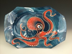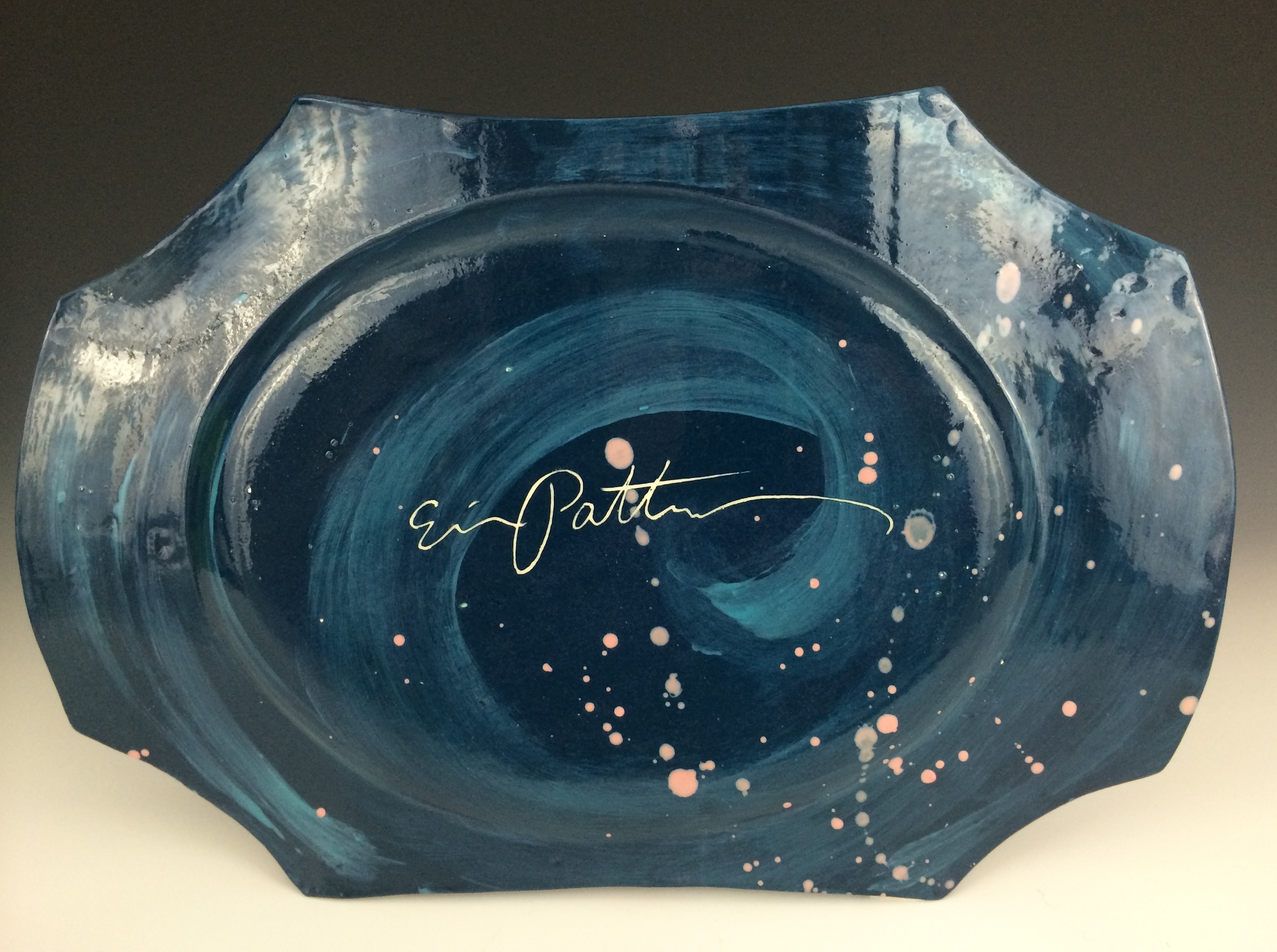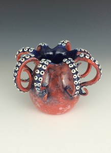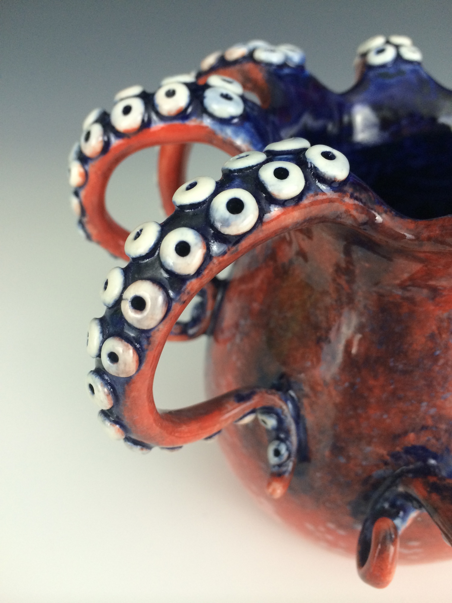
Many of my ocean-themed pieces have light washes and hints of color, but are mostly white. I use this technique to keep the pieces peaceful, giving them a soft look. On these recent pieces, however, I decided to experiment with more vibrant color to see what effect it would have on a similar theme. I love the contrast of the red-orange with the blues, and I am also happy with the more chaotic style of painting on both of these pieces. I felt more free and unrestrained as I painted, and it shows in the finished work. I feel these pieces have an energetic quality that I would like to continue to experiment with in the future.